
Landing Page – The Hierarchical Structure
Introduction
When designing an online landing page for a business report pack, there are several ways to approach the layout. In this post, we will explore the core design concepts and demonstrate how to achieve them using the versatile options available in Sharperlight Publisher.
Practices
The landing page we are looking at today features a hierarchical structure created by several Sharperlight Published Reports.
In this hierarchical structure, a parent report contains a child report that acts as a navigation menu. A default published report is then displayed within the main content area of that menu.
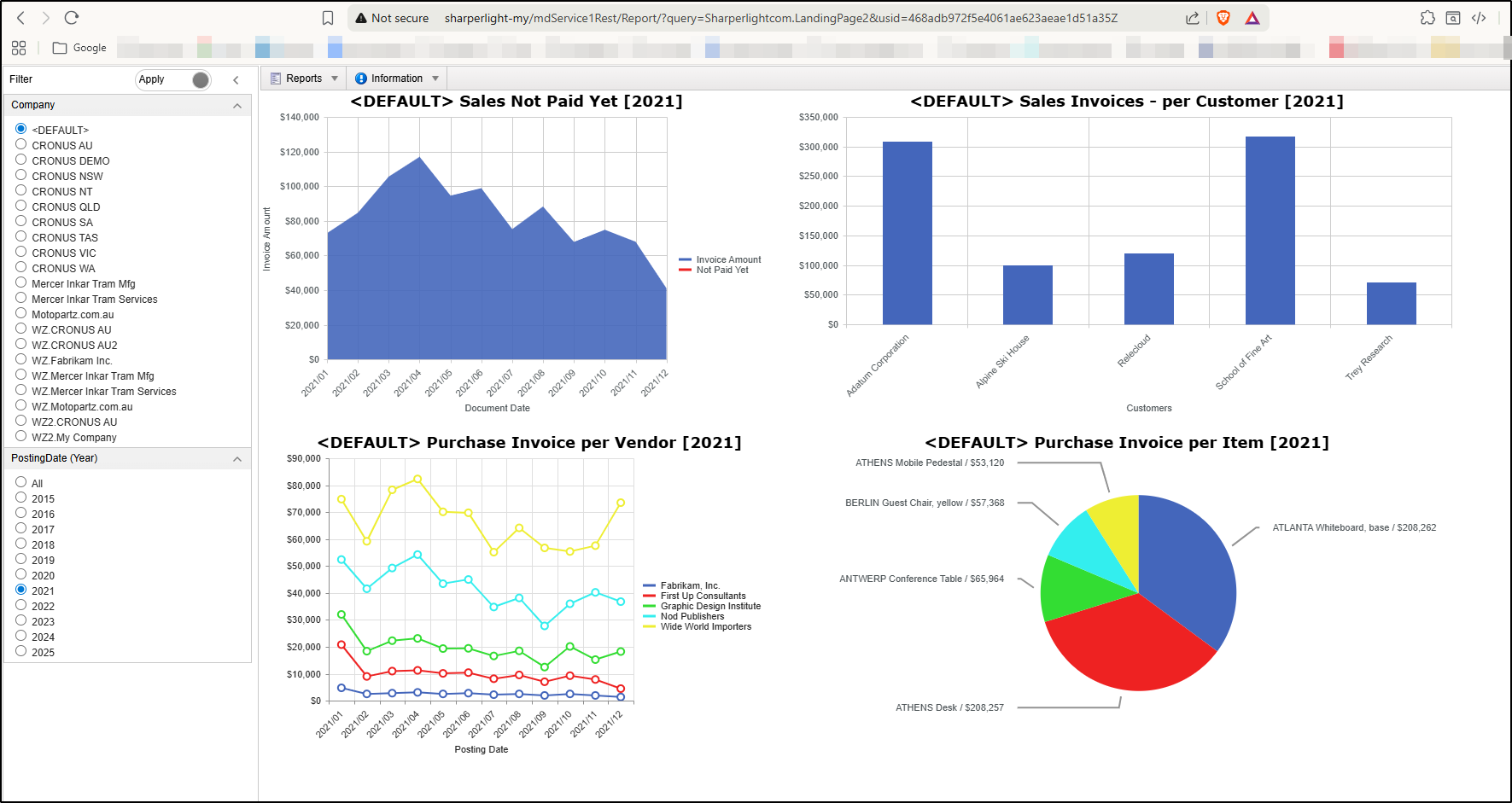
As shown in the image, the parent report is configured as a ‘Filter Pane Left‘ report. The navigation menu is built using a ‘Menu Horizontal‘ report, then a specific report with the ‘Layout‘ option is designed as its default content.
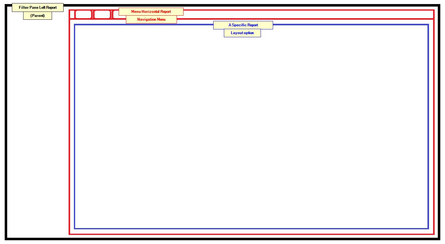
Now, let’s examine each component in detail. For this walkthrough, we will be using the Dynamics 365 Business Central datamodel as our primary source.
Filter Pane Left Report (Parent)
Let’s walk through the design of the parent report. This report acts as the primary container for all other components and is configured using the ‘Filter Pane Left’ template.
This setup provides a global filter, where the selected values are dynamically passed to all child content through a specific parameter-sharing method.
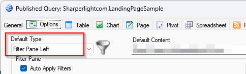
Default Type
The Default Type of the report must be “Filter Pane Left” for this example.
Query
This filter is designed by the query of the published report.
We want to enable filtering by Company and Posting Date (Year), using a query like this;
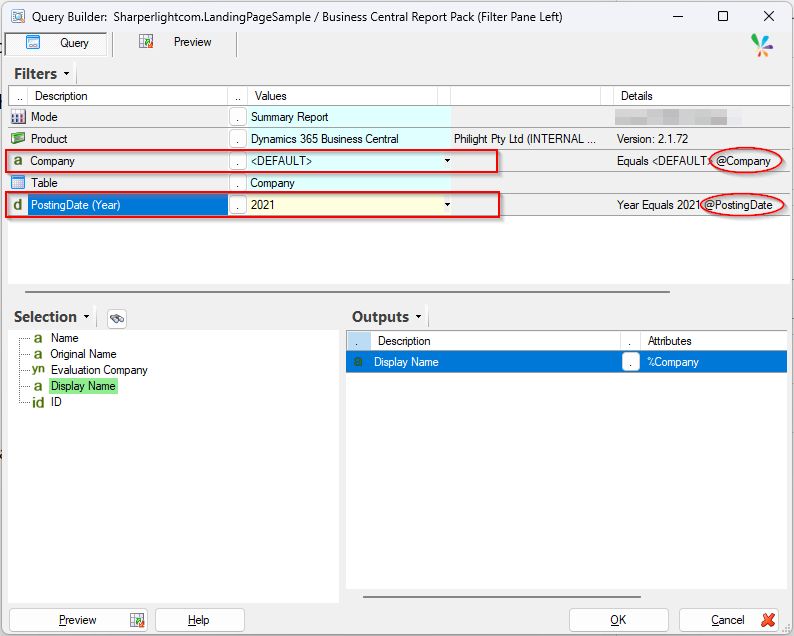
The most important factor here is the naming of the filters: @Company and @PostingDate.
For the global filters to function correctly, every child query must use these exact parameter names to receive and process the passed values.
Menu Report (Navigation Menu)
This creates the menu bar at the top and the menu structure is created with the menu editor or the query builder.
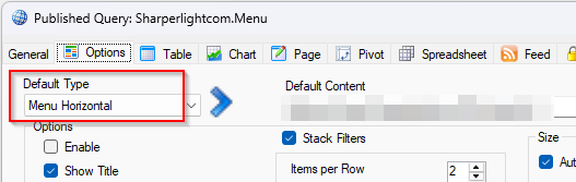
Default Type
The Default Type of the report must be “Menu Horizontal” for this example.
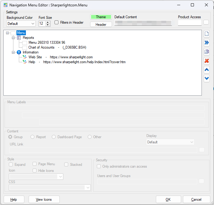
Menu Editor
The menu structure is designed by using this editor. It cab be opened with Edit Query button.
If you’d rather not build this from scratch, you can use the wizard style of creation. You’ll find the full reference for this in the “Menu for Published Reports“.
A couple of reports are configured under the Reports node for this example.
A report with Layout option
Next, we will design a composite report using the ‘Layout’ option. This allows us to aggregate several different reports into a single, unified page.
This is used as the default content of the Menu report.
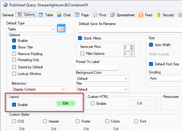
Layout
Use the Layout option for this published report.
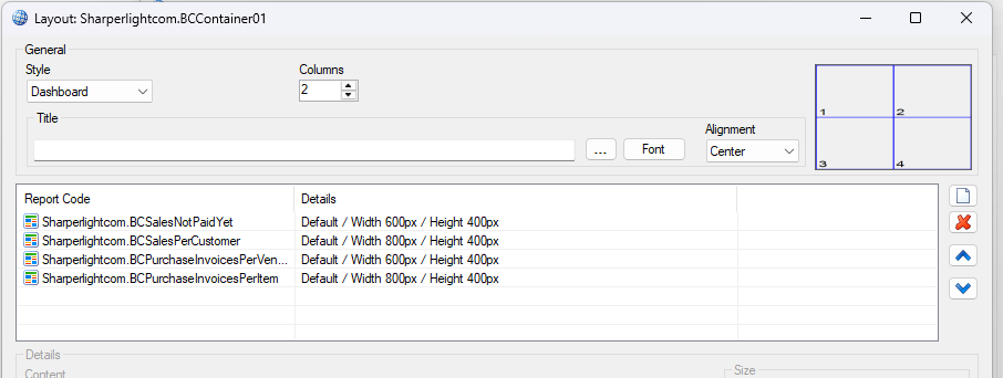
We place four reports which display charts.
Default Type
It can be Table type as default.
Query
The query is not required but it must be defined so a simple query is enough.
Making the hierarchy structure
Now that we have created all the individual components—the Filter Pane, the Menu, and the Layout report—it is time to integrate them into a single, cohesive dashboard.
To link the components, copy the URL of the Menu report and paste it into the Default Content property of the Filter Pane report.
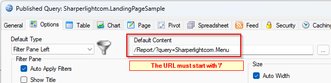
Then set the URL of the Layout report to the Default Content property of the Menu report.
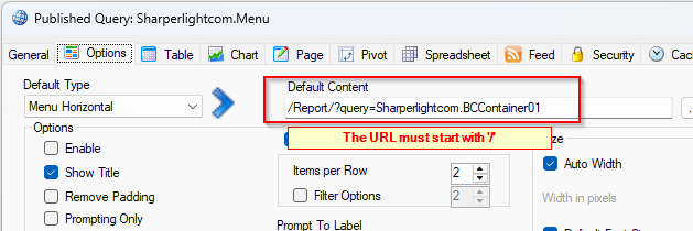
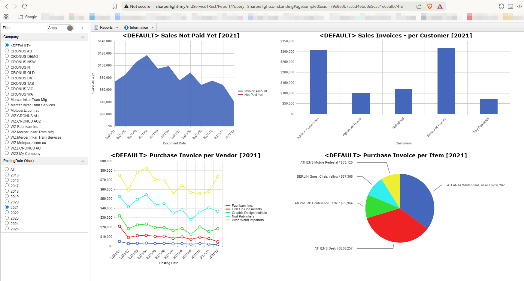
Our dashboard is now complete! Let’s take a look at the final preview to see how all the components work together.
The Filter Pane is positioned on the left, with the Menu report acting as its primary content. While the Menu report successfully populates the horizontal navigation bar at the top, and the Layout report which is the default content of the Menu report shows four charts in it.
Afterword
We hope this post gives you some inspiration as you design your own landing page.
Other References: