
Slicer-Driven Reports with Layout
Introduction
This post shows you how to create a dashboard style of report and a slicer refreshes the multiple reports in a page.
Practices
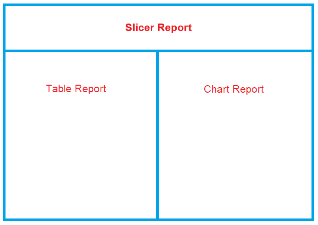
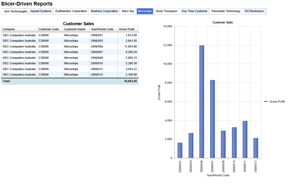
We will create this type of report shown below.
Selecting one of the customers in the list shown horizontally kicked in refreshing the linked reports (1) and (2).
Therefore, we will create three reports, a Slicer report, a Table and a Chart, and we will use the “Layout” option.
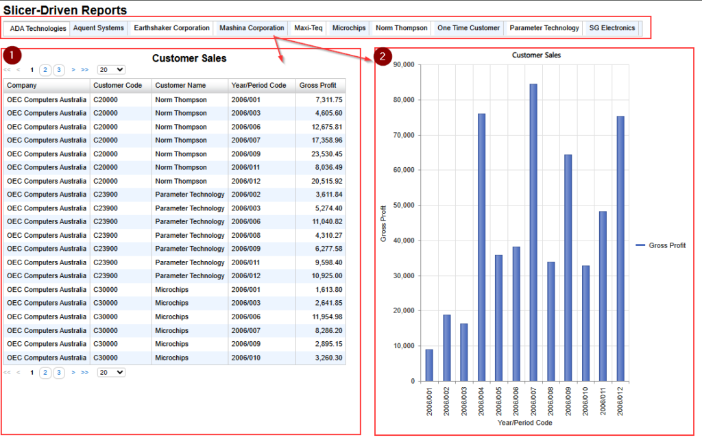
The slicer provide the selection list with the output of the query.
The key to making this work is that the target filter name in each linked report must exactly match the name of the output field from the slicer report.
In this example:
- The slicer must output a customer name field and its name must be “CustomerName”.
- The target filter (customer name) in each linked report must also be named “CustomerName”.
Let’s start building it. In this example, we’ll use SAP Business One as the product.
Slicer Report
This provides the list of customer names as the result of the query.
This query requires to return the list of customer names so we use Sales A/R table.
Select the “Customer Name” field as an output item and name it “%CustomerName“.
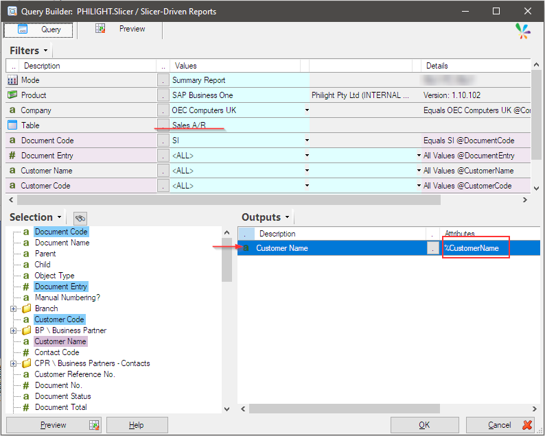
Table Report
We create a report that displays sales information in a table.
The “Sales A/R” table is selected and all mandatory filters are set. However, “Customer Name” is not set to the filter so drug and drop the “Customer Name” field from the Selection pane to the Filter pane.
The name must be “@CustomerName“.
The outputs are set as shown below.
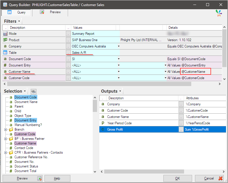
Chart Report
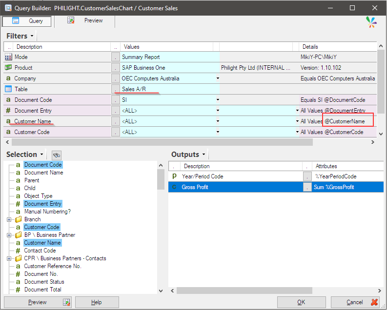
We create another report which shows sales figure in a column chart.
The “Sales A/R” table is selected and all mandatory filters are set. However, “Customer Name” is not set to the filter so drug and drop the “Customer Name” field from the Selection pane to the Filter pane.
The name must be “@CustomerName“.
The outputs are set as shown below.
Layout option
Those three queries have now been prepared. Let’s move to the final step: combining these three reports to create a single unified report.
We use the “Slicer Report” is the host of the “Layout” option, and define the following layout design.
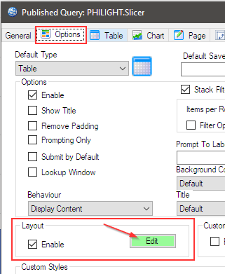
Open the “Slicer Report” that was created at the beginning. Then go to the “Options” tab.
Enable the “Layout” option, then click the “Edit” button.
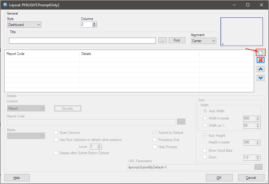
Layout editor opens and click “New” icon.
The first entry is added. It must be “Slicer Report” and the five parts of the options must be set.
Set the “Columns” option to 2, as the table report and the chart report need to be displayed side by side (in parallel).
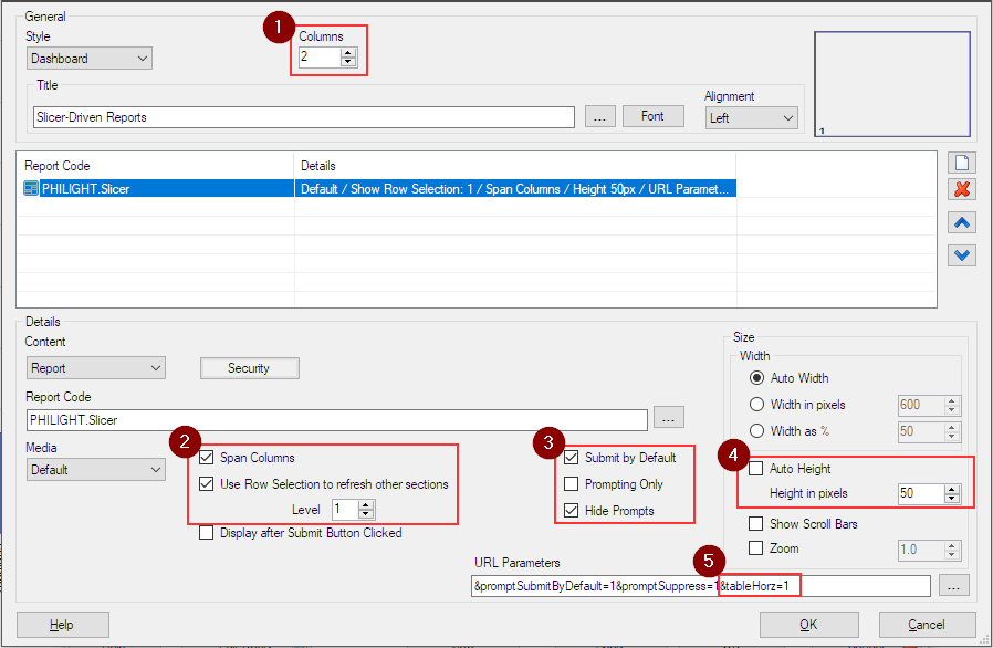
Add “&tableHorz=1” parameter at the end of URL Parameters text field (5). This works for showing the output horizontally.
Click “New” icon to add the “Table Report” (1), and browse and select the table report by clicking the three dots button (2).
Then these options (3,4 and 5) must be set.
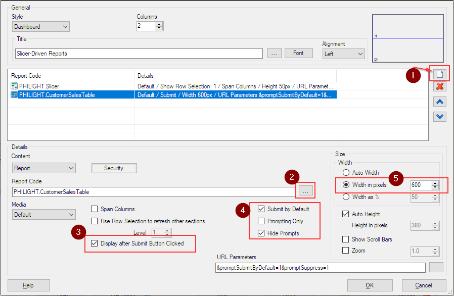
Click “New” icon to add the “Chart Report” (1), and browse and select the chart report by clicking the three dots button (2).
Then these options (3,4 and 5) must be set.
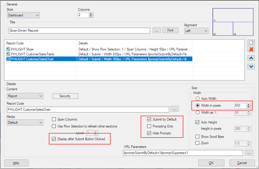
The layout settings are now complete.
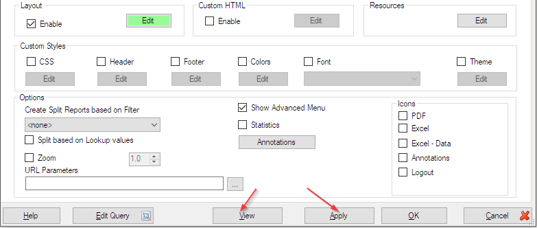
Click “OK” to save the layout settings.
Click Apply to save the report definition. Then, after confirming that the Sharperlight service is running, click View.
The report must look like this: the slicer report is shown at the top and the table report and the chart report displayed side by side (in parallel / in two columns).
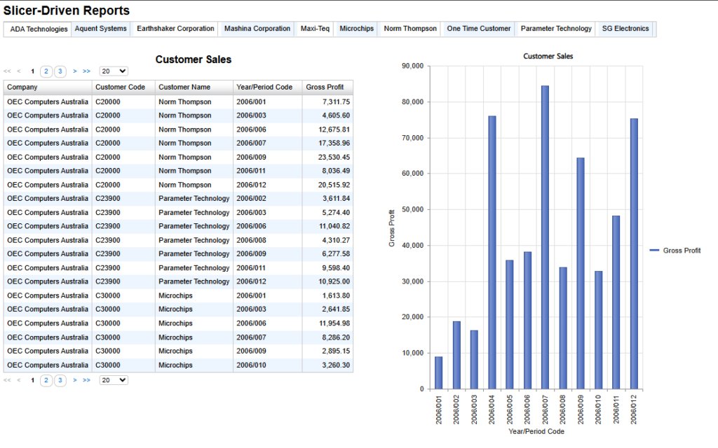
The currently selected customer in the slicer is reflected in both reports.
Afterword
Please remember that the key to this configuration is consistency between the output name in the slicer and the filter names in the linked reports. These matching names determine which values are passed to all reports placed in the same layout.