
Slicer-Driven Reports with Dashboard Page
Introduction
This post shows you how to create a dashboard style of report and a slicer refreshes the multiple reports in a page.
Practices
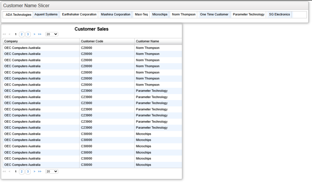
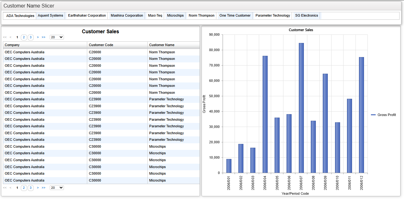
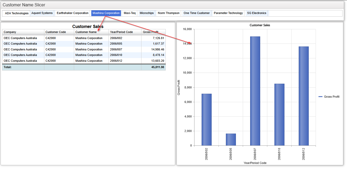
We will create this type of report shown below.
Selecting one of the customers in the list shown horizontally kicked in refreshing the linked reports (1) and (2).
Therefore, we will create three reports, a Slicer report, a Table and a Chart, and we will place them in a “Dashboard Page“.
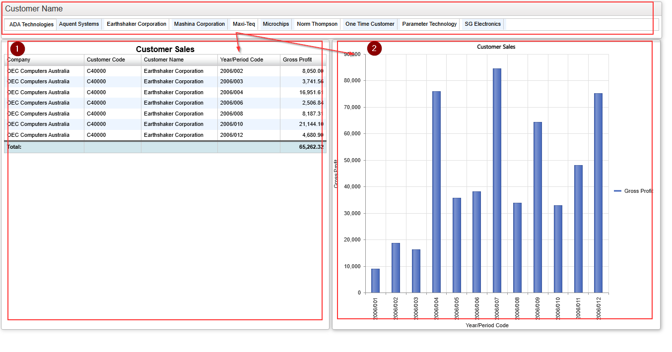
The slicer provide the selection list with the output of the query.
The key to making this work is that the target filter name in each linked report must exactly match the name of the output field from the slicer report.
In this example:
- The slicer must output a customer name field and its name must be “CustomerName”.
- The target filter (customer name) in each linked report must also be named “CustomerName”.
Let’s start building it. In this example, we’ll use SAP Business One as the product.
Slicer Report
This provides the list of customer names as the result of the query.
This query requires to return the list of customer names so we use Sales A/R table.
Select the “Customer Name” field as an output item and name it “%CustomerName“.
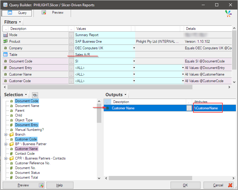
Table Report
We create a report that displays sales information in a table.
The “Sales A/R” table is selected and all mandatory filters are set. However, “Customer Name” is not set to the filter so drug and drop the “Customer Name” field from the Selection pane to the Filter pane.
The name must be “@CustomerName“.
The outputs are set as shown below.
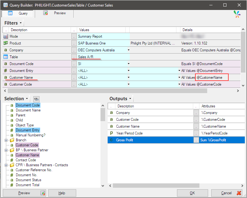
Chart Report
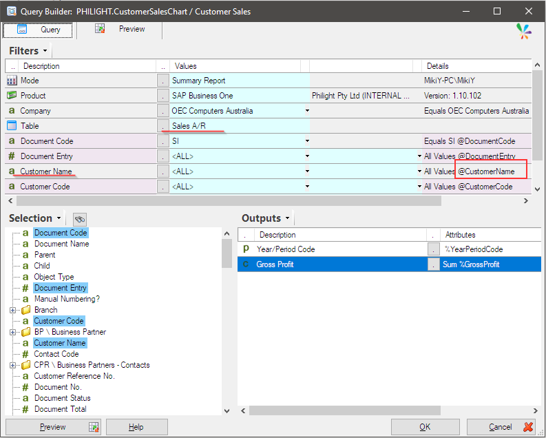
We create another report which shows sales figure in a column chart.
The “Sales A/R” table is selected and all mandatory filters are set. However, “Customer Name” is not set to the filter so drug and drop the “Customer Name” field from the Selection pane to the Filter pane.
The name must be “@CustomerName“.
The outputs are set as shown below.
Dashboard Page
Those three queries have now been prepared. Let’s move to the final step: combining these three reports to create a single unified report.
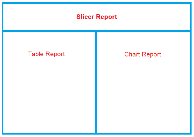
We use Sharperlight Dashboard Page designer and build the following page design.
Open your web browser and go to the following URL to start designing the dashboard page:
“http://{your pc name is here}/mdService1Rest/index“
The URL takes you to the Sharperlight Service Index page.
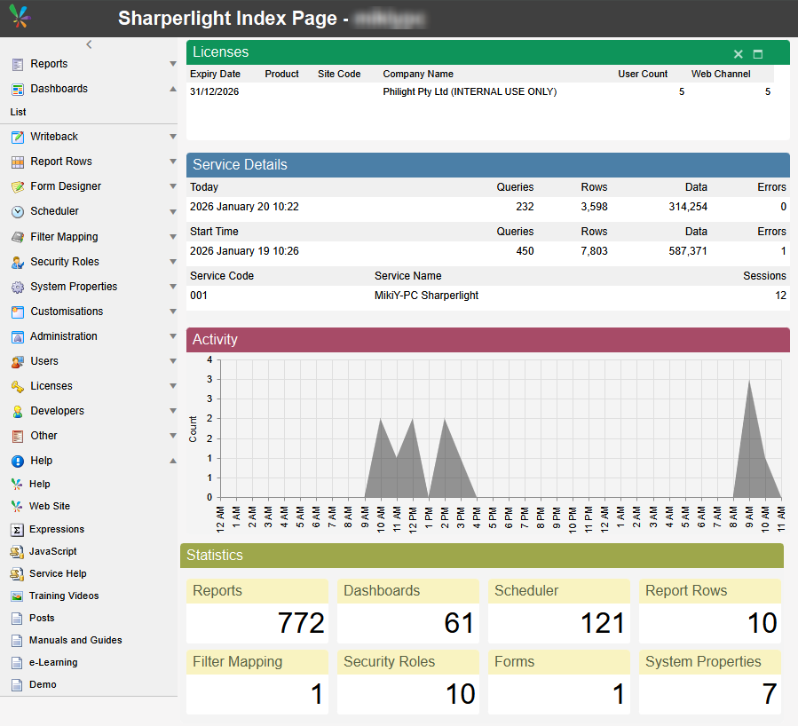
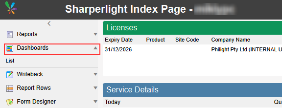
Go to “Dashboards”.
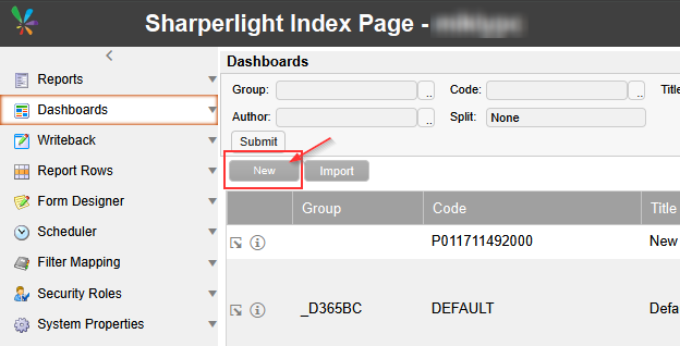
This takes you to the list of dashboard pages. Click “New” to create an empty dashboard page.
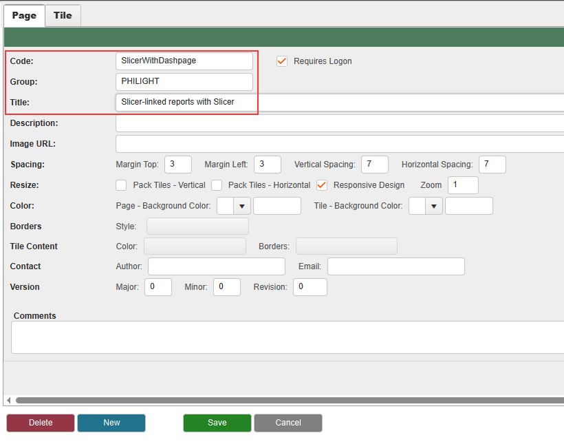
Filling in “Code”, “Group”, and “Title” is sufficient — you can leave the other options at their default values.
Then click to save it.
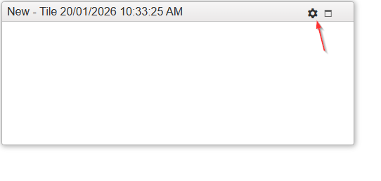
You would see a new tile like this. Move your cursor at the top-right corner of the tile to show a gear icon.
Click the gear icon to enter the edit mode.
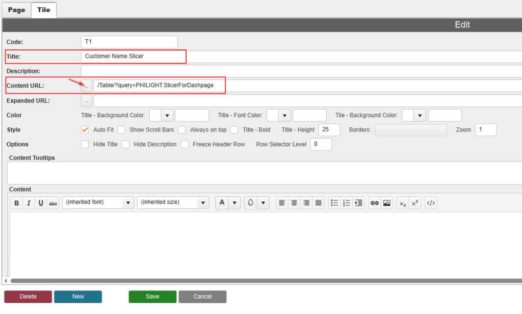
Enter the Title for the dashboard tile. Then select the published report which works as the slicer. You can use the lookup button to find the published report.
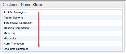
Click the “Save” button to save the tile. You should now see the list of customer names displayed vertically.
We want the list displayed in horizontal format so click the gear icon to enter the edit mode.
Add “&tableHorz=1” parameter at the end of the content URL. Click “Save” button to save it.
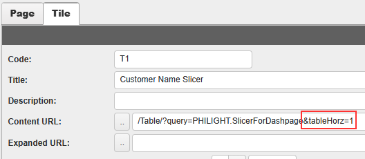
The list should now be displayed horizontally.
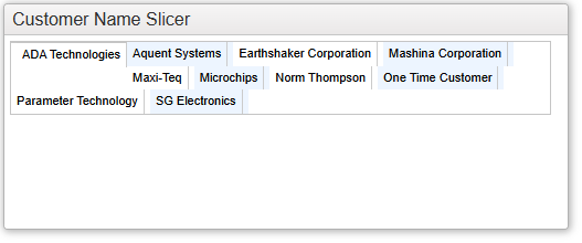
You can expand the tile using the mouse to make it fit nicely.
Please remember to save the change of the tile size you have to go into the edit mode and click “Save” button.

Let’s add a new tile for Sales Information in table format. To go to the edit mode, you can use the gear icon for the slicer tile.
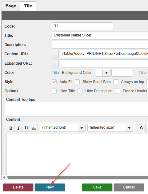
In the edit mode, click “New” button to add a new tile.
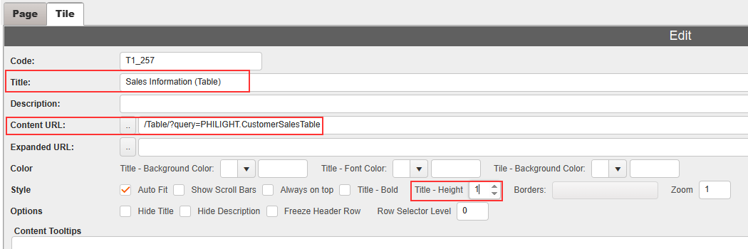
Enter the Title for the tile. Then select the published report that displays sales information in table format. Finally, set the Title Height option to 1 to hide the tile’s title.
Save it and adjust the tile size for the table. Don’t forget to save the changes to the tile size.
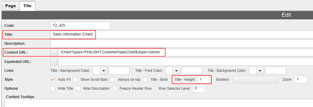
Add a new tile again. Configure it to display the sales information in chart format.
Your dashboard page is now complete.
Let’s try to see the slicer works. However, it doesn’t work. You have to do one more thing.
Go into the edit mode for Slicer tile and do one of the following:
- Add “&rowSelectFilter=1” at the end of the Content URL, “/Table/?query=PHILIGHT.SlicerForDashpage&tableHorz=1&rowSelectFilter=1“
- Set “1” for the option “Row Selector Level”
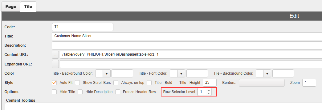
Please make sure that the other reports on the same page must have “0” for their “Row Selector Level” option.
The slicer is now working correctly: when you select a value in the slicer, the linked reports (table and chart) refresh automatically to reflect the selected item.
Afterword
Please remember that the key to this configuration is consistency between the output name in the slicer and the filter names in the linked reports. These matching names determine which values are passed to all reports placed in the same page.